
Context
Incident.io provides tools for managing and communicating incidents, including hosted status pages used by companies like Linear, HashiCorp, Etsy and Square. These pages were already live in production for hundreds of paying customers and often used during outages, so stability and visual consistency were critical.
In early 2023, OpenAI committed to adopting our status pages, bringing with them a huge audience: their existing Atlassian-hosted page had around 250,000 subscribers — 10× more than our second-largest customer at the time. It was a major opportunity and a reputational risk. But the pages hadn’t been touched in months and no team currently owned them.
Problem
The existing pages had drifted significantly from our design system. Years of small tweaks had created visual clutter: duplicate components, gradients, inconsistent spacing, and unclear hierarchy.
Because major customers were already using the pages, the redesign had a strict constraint: it had to modernise the experience without breaking trust or disrupting existing users. These companies were historically very sensitive to visual change — any unexpected modification risked support tickets or frustration during an outage.
Approach
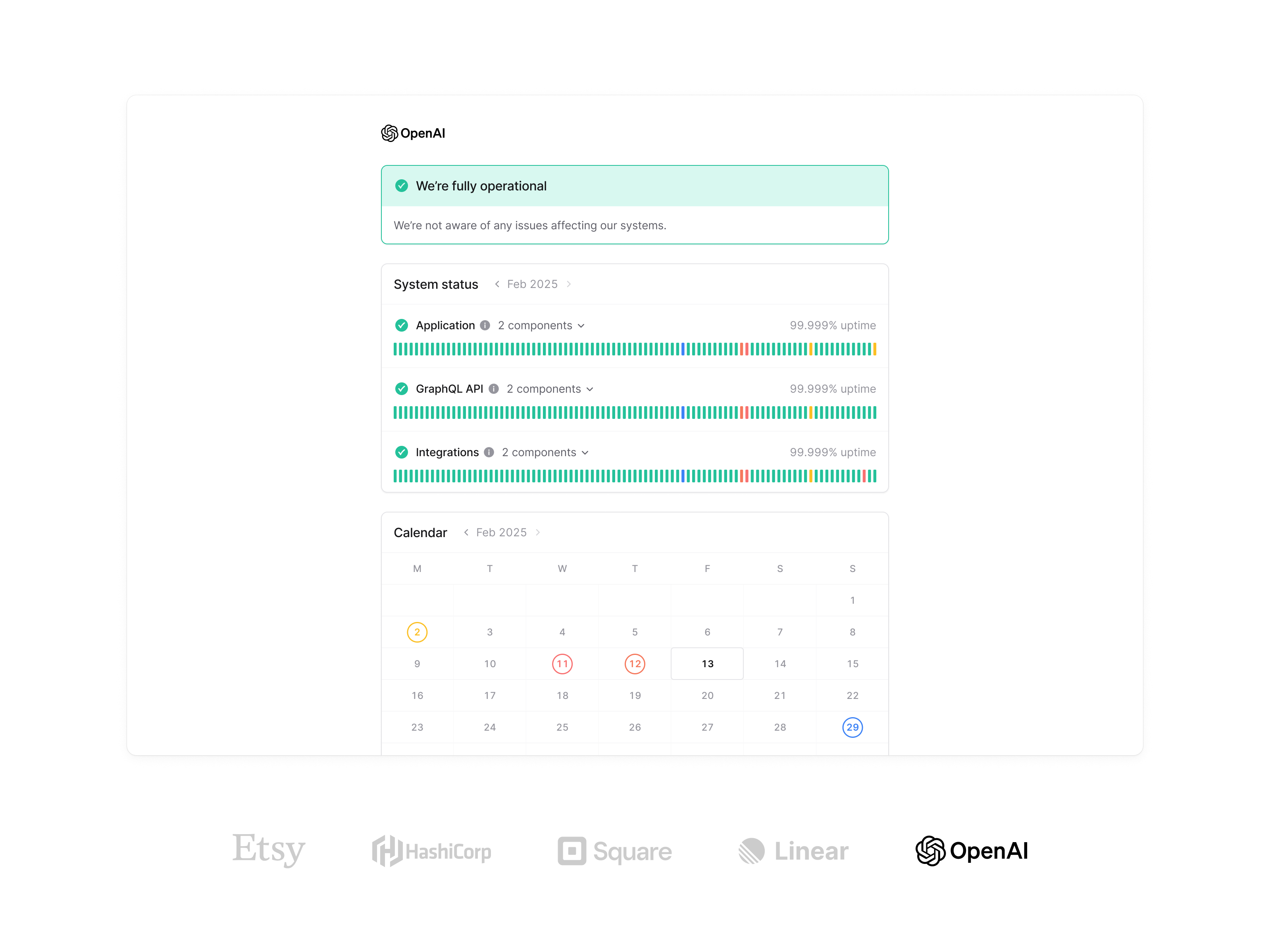
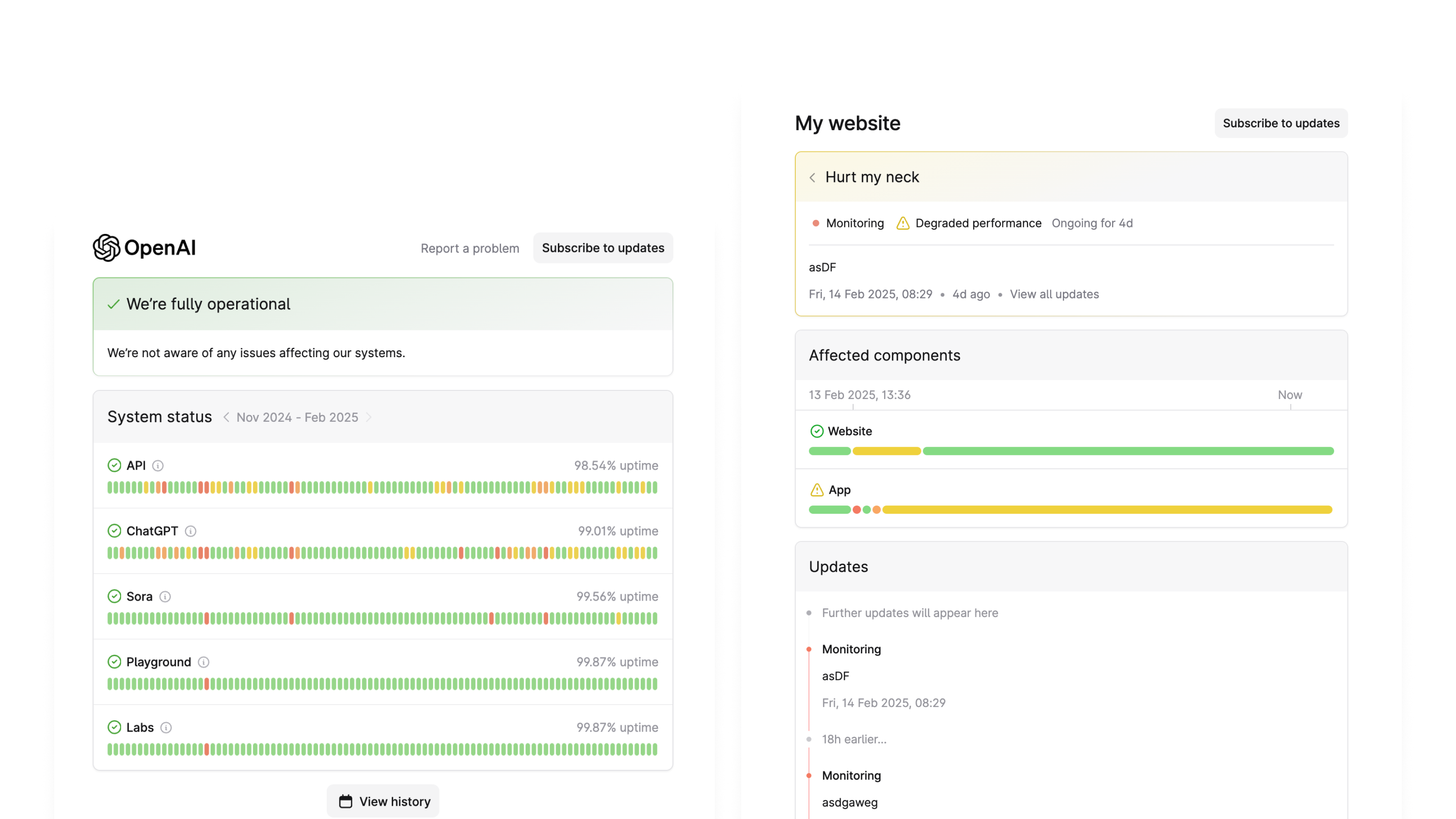
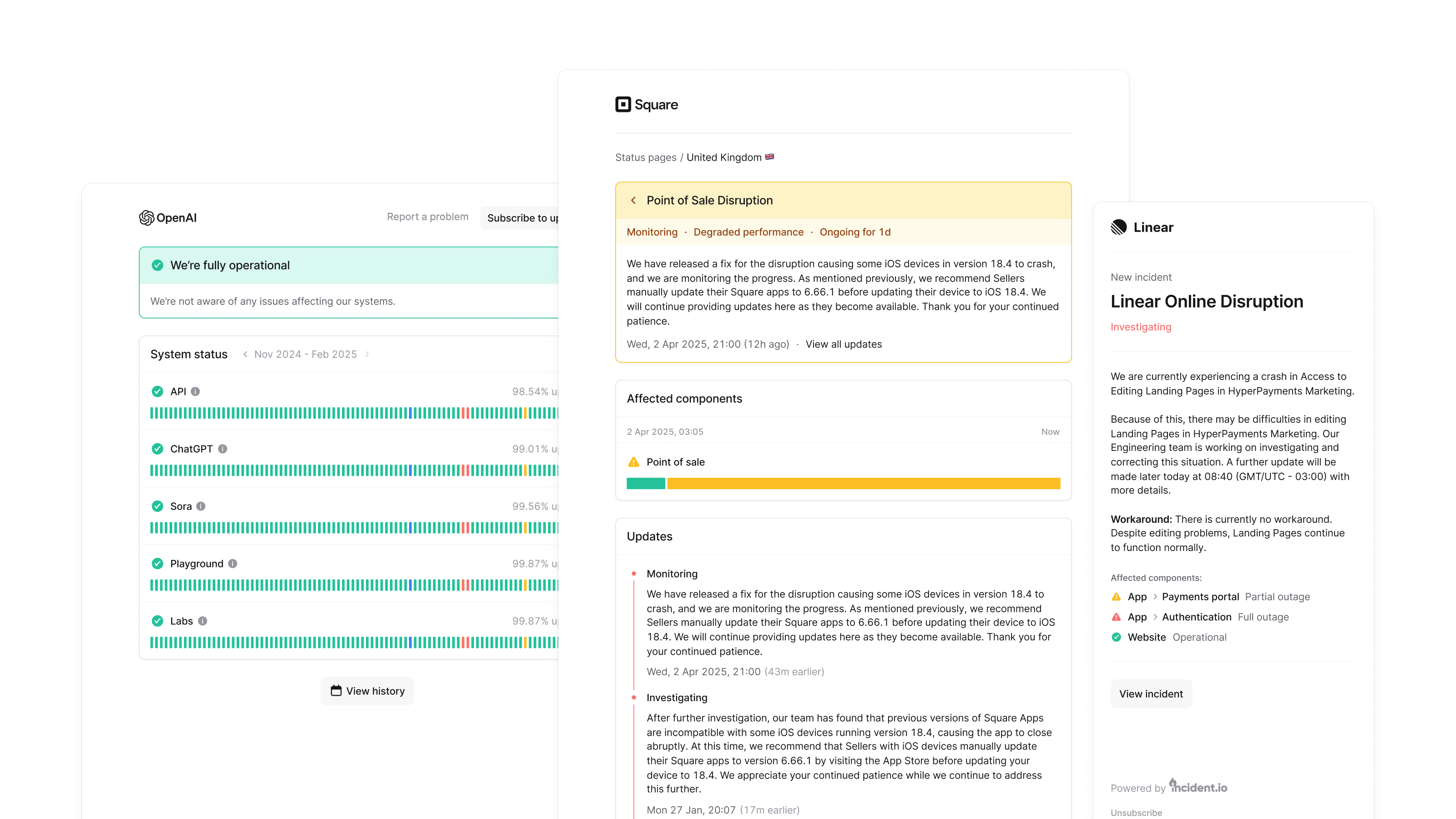
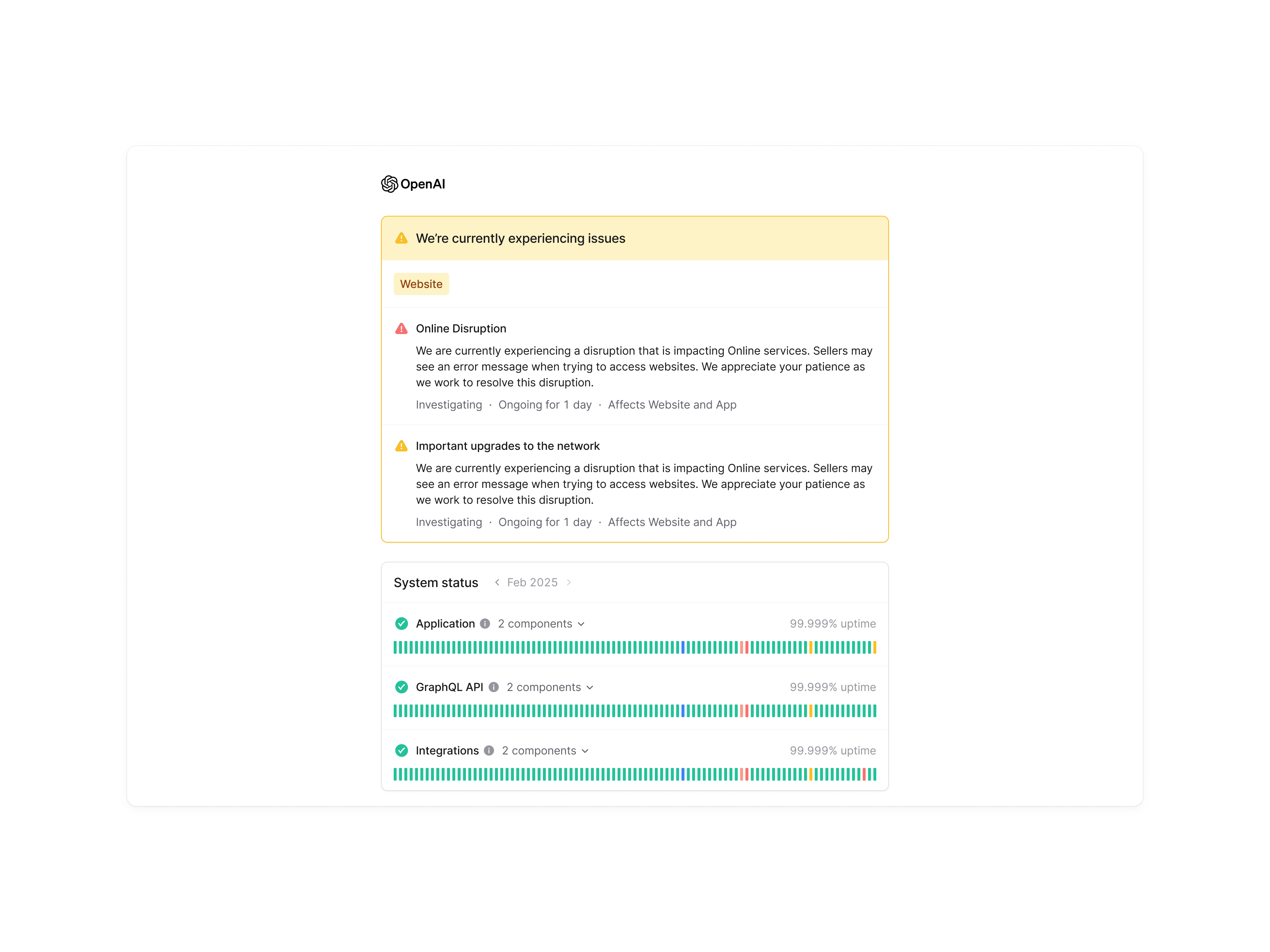
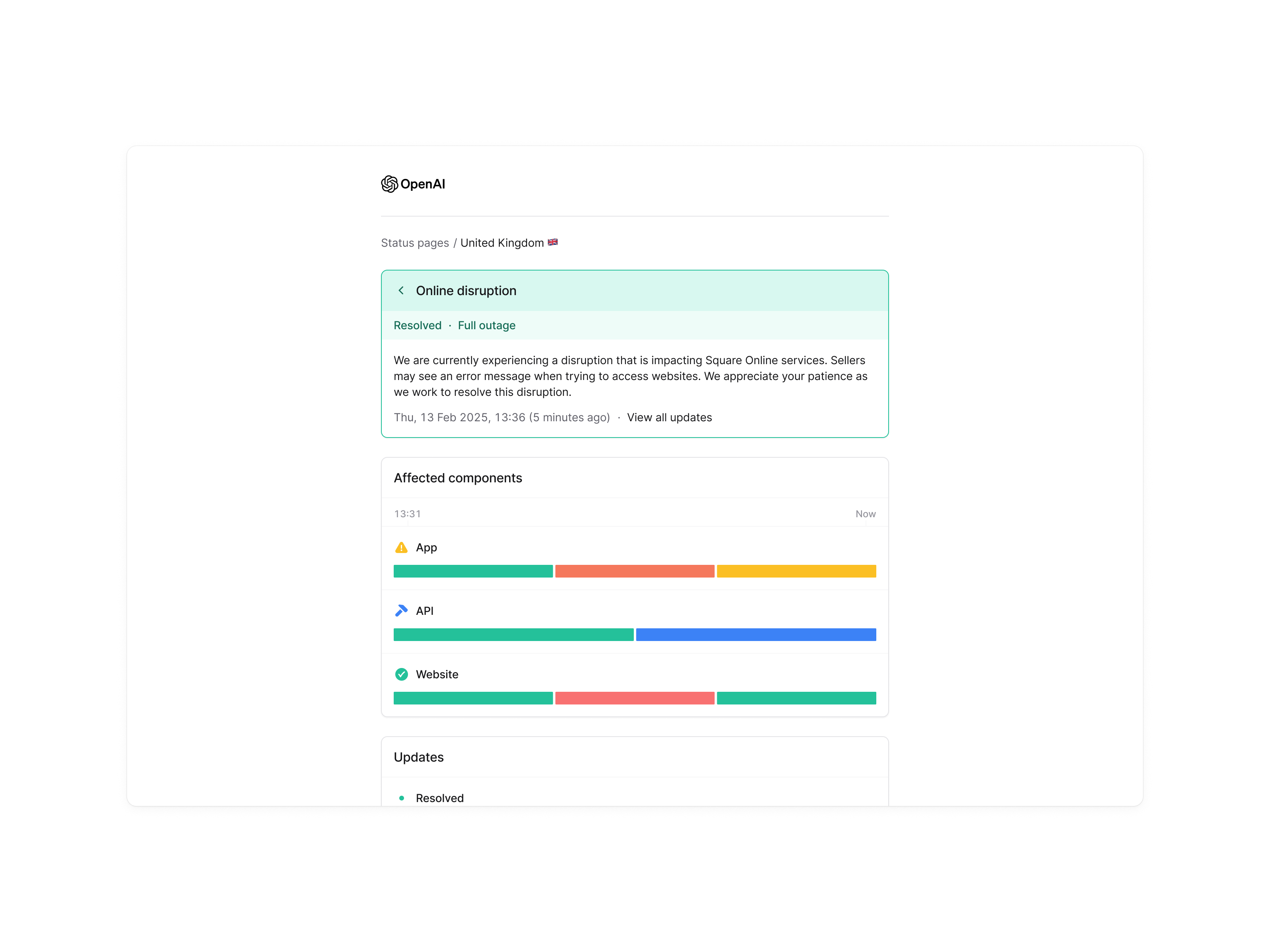
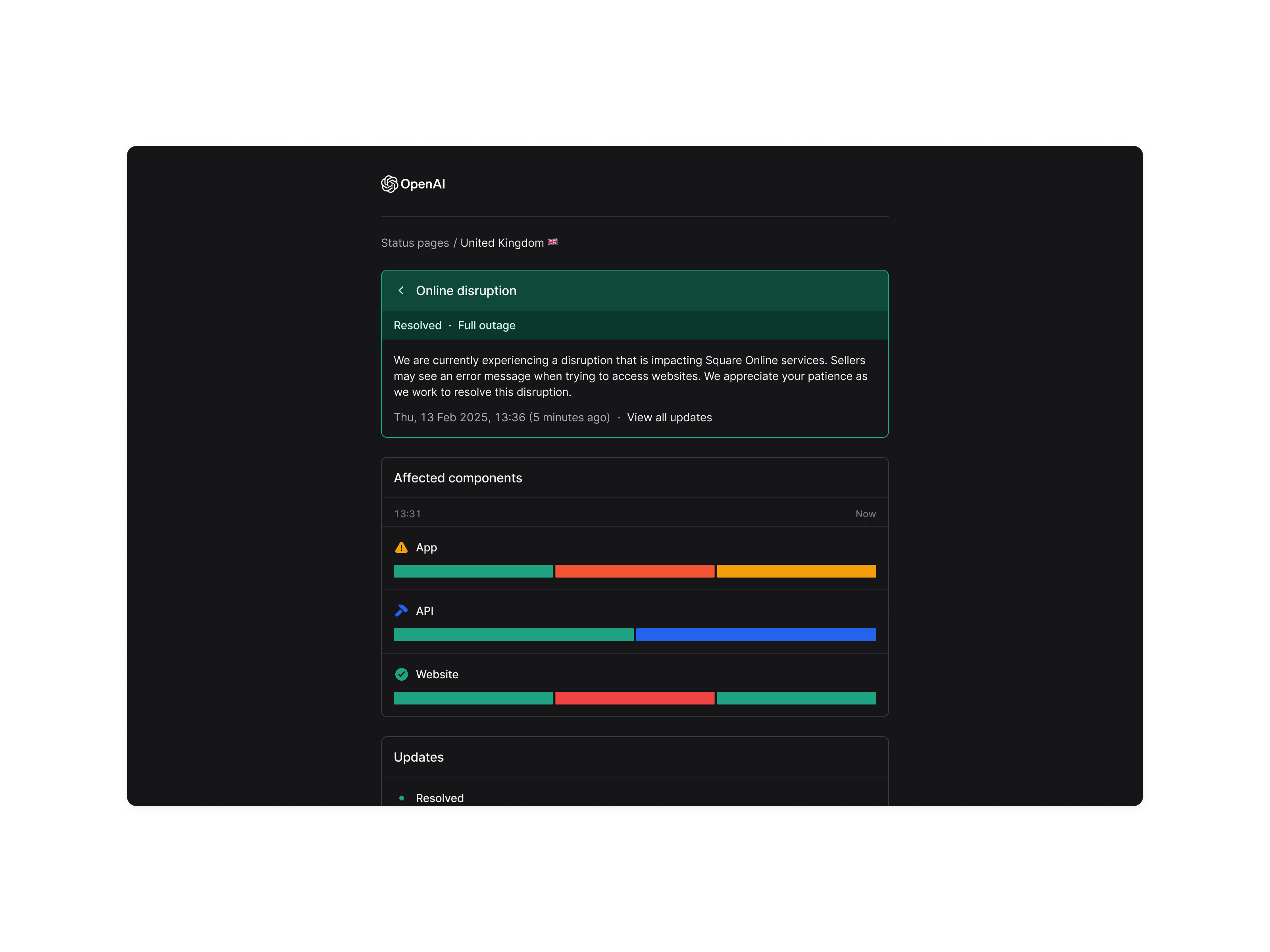
I began with a UI audit, mapping out misalignments, redundant styles and areas that deviated from our design system. The redesign focused on clarity and neutrality: removing decorative elements, standardising spacing, and creating a calm visual baseline that could sit comfortably beneath any customer’s brand.
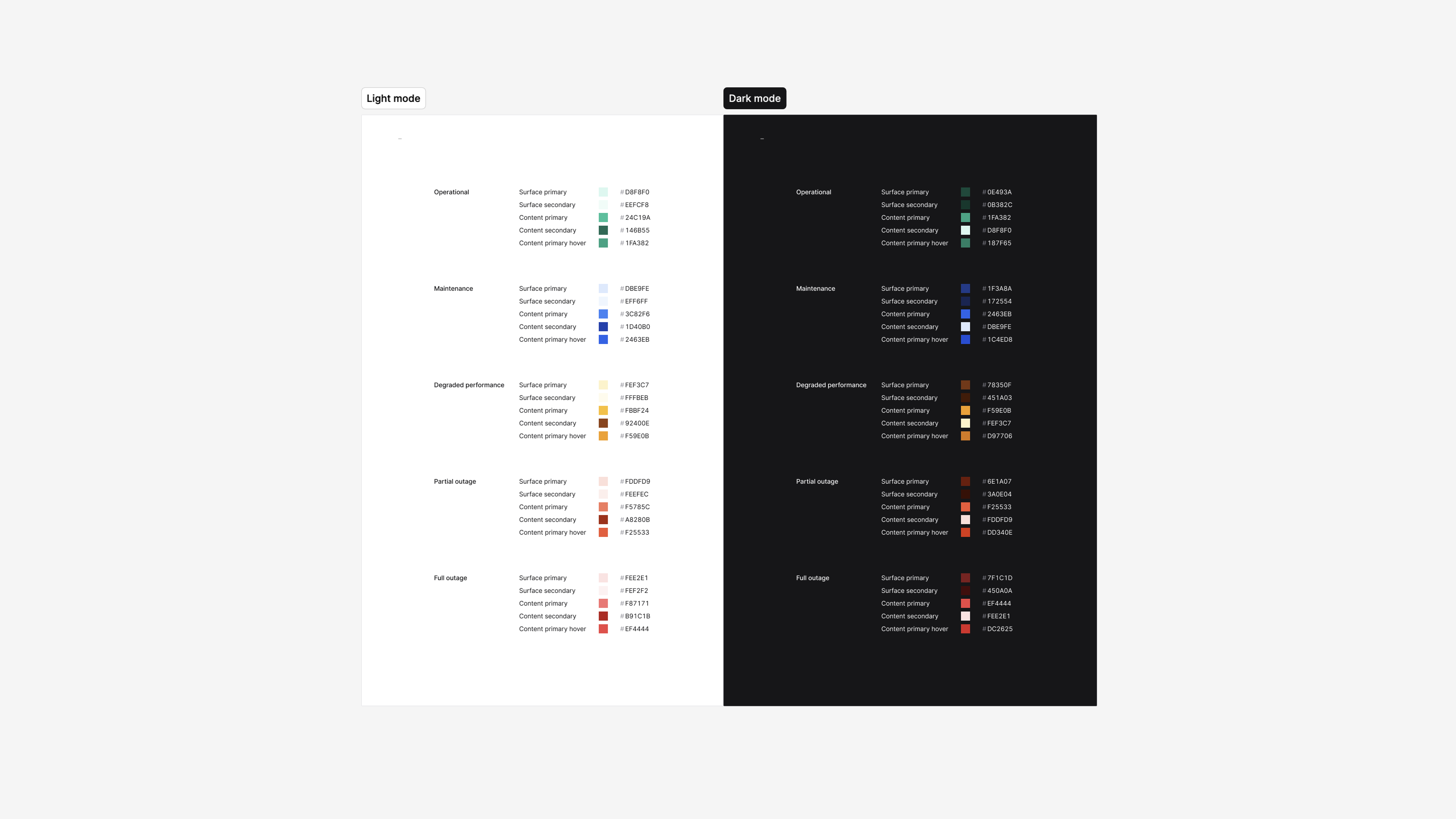
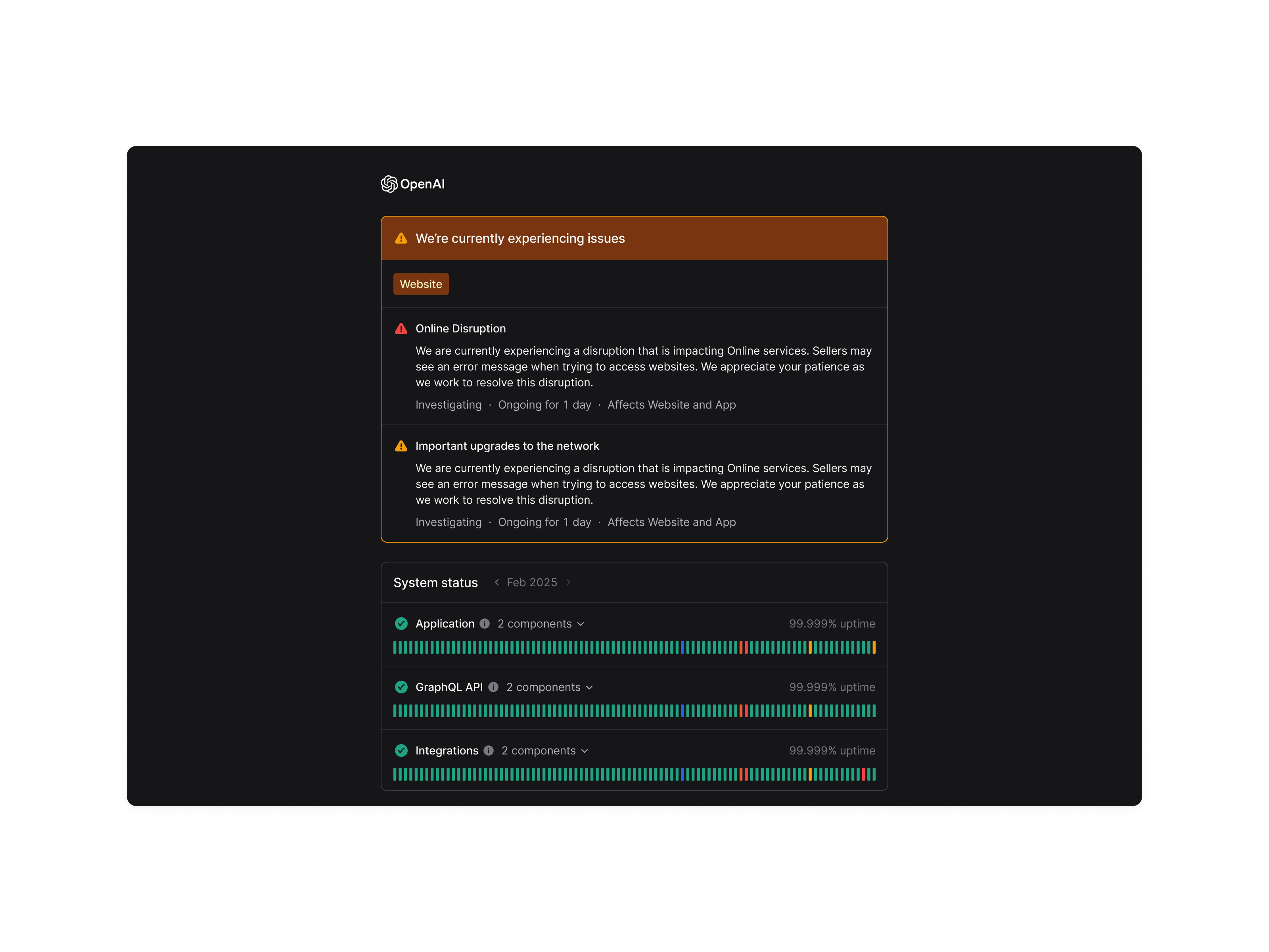
Most customers place their own logos at the top of the page, so the UI had to behave like part of their identity, not ours. This meant a strictly monochrome palette, with colour used sparingly for clear incident states (up, degraded, down).
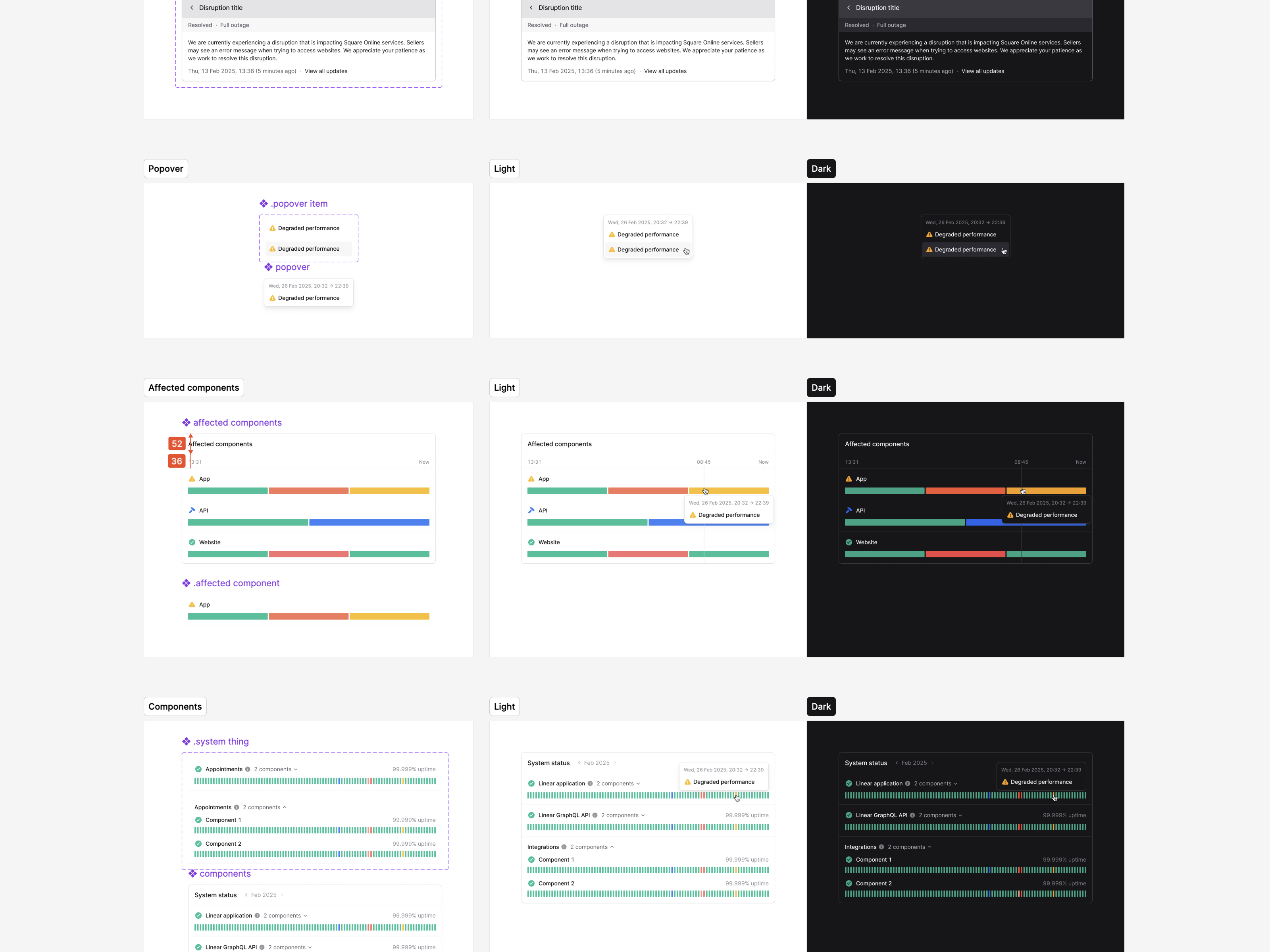
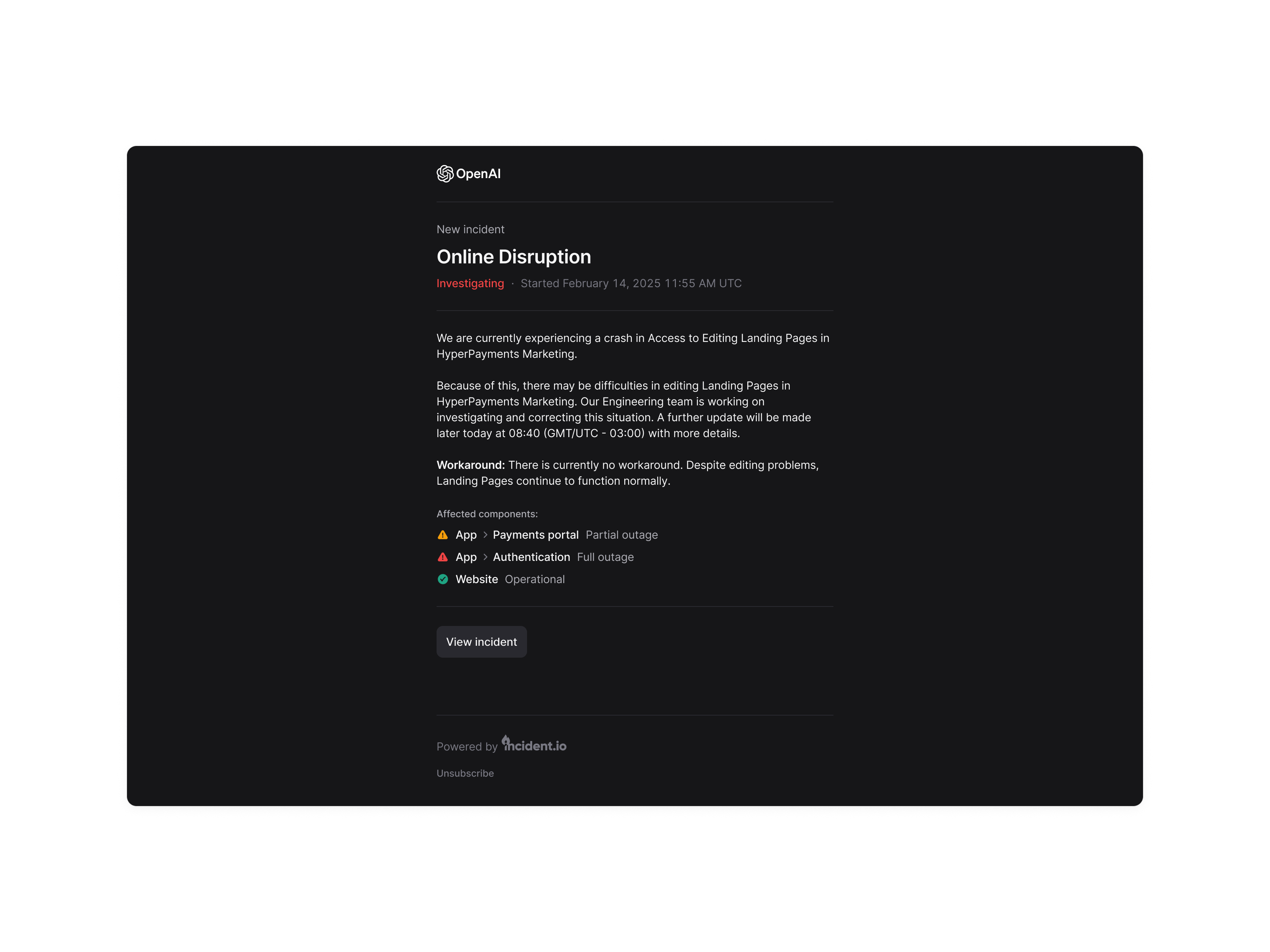
To enable long-term consistency, I rebuilt the theming system using Figma variables, so every component could switch between light and dark mode automatically — a major improvement to maintainability.
Once the design was approved, I paired with engineering and contributed directly to the implementation using Cursor and AI-assisted refactors. This accelerated the rollout and helped maintain a high level of fidelity.
Solution
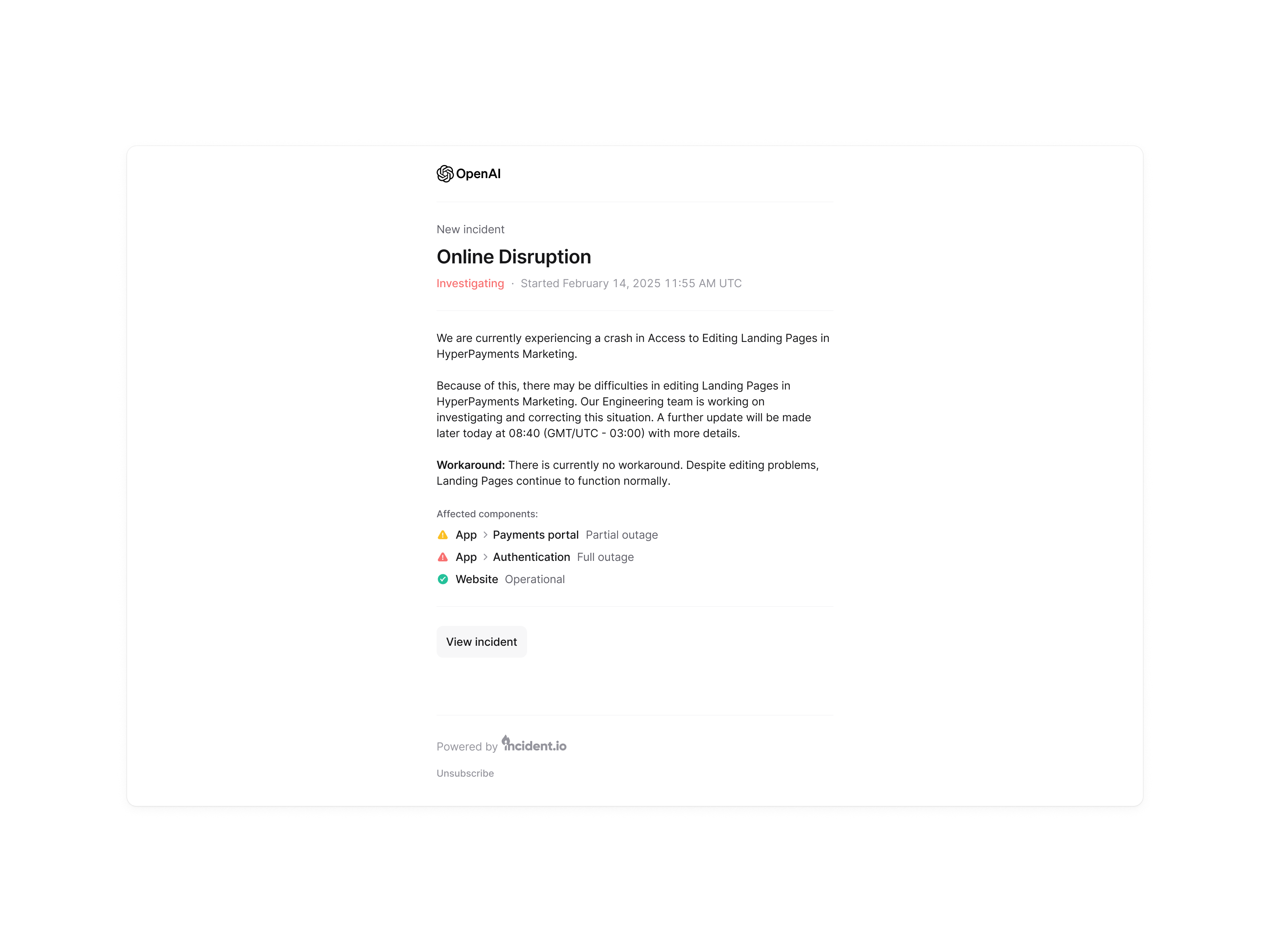
A clean, minimal, trustworthy status-page design that aligned with our design system, presented information clearly, and stayed visually neutral across customers. The new layout improved readability, simplified the hierarchy, and removed the visual “jank” that had accumulated over time.
Impact
The redesign launched ahead of OpenAI’s rollout and was viewed by hundreds of thousands of users within the first weeks. Despite the sensitivity of our existing customer base — including Linear, HashiCorp, Etsy and Square — the launch resulted in zero complaints, demonstrating that we improved the product without disrupting expectations.
Internal feedback was extremely positive, and the redesign became a reference point for customer-facing surfaces across Incident.io. It also strengthened trust with enterprise prospects and set the visual foundation for future product marketing surfaces.